- I believe that the combination of our main task and our ancillary tasks is very effective. It is very easy for the audience to make a link between the music video and the ancillary tasks. This is due to several things:
 The continuity of the font, i.e. we used the same font style of ‘Sweet Confusion’ on both of our Ancillary tasks.
- We use similar colours in the Ancillary tasks, such as with the font which is ver
 y alike in both tasks, a
  bright gold/silver colour. Furthermore, the predominant tone of both the Ancillary tasks is dark, and this helps link to the music video as well, as the tempo is slow and the interpretation is moderately depressing.
 - The images used in the Ancillary tasks are directly linked to the main product of the music video. The CD digipak has a picture very similar to a
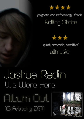
 shot we used in the final cut of the music video, which is a shot of Glenn standing in front of a pond with a cigarette in his hand. Although this is heavily edited, to make it stand out more, the camera angles are very similar and the contents of the shot are the same.
  Moreover, the relation between the magazine advert and the music video was more evident in the rough cut video as the picture on the advert was taken directly from the rough cut. We planned to overlay a faded image of Glenn onto the shoulder of Glenn, but this shot did not make the final cut. However, the mise en scene used in the advert is evident throughout the music video itself and the same camera angle with Glenn in the same position is used multiple times.
 - Furthermore,
 the Ancillary tasks are both linked through images as the magazine digipak has a picture of the CD digipak front cover on it, so the audience are aware of the product they could potentially be buying.
 - Another
 point that links the main task to the magazine digipak is the fa
 ct that the use of faded shots is a major feature of both. The main focal point of the ancillary task is the picture of Glenn with his hood up looking down, and during the video there is a point in which we have used the original overlay idea, but not with the original picture that we choose for the magazine advert.


This has all led to what can only be considered a house style being created. This house style led to the same font being used along with similar images and this allowed for all of the tasks to interconnect. The main product is the centre of the ancillary tasks, as the ancillary tasks derive directly from the main product, which allows the link to be clearly seen by the potential audience.
Furthermore, whilst creating our product we aimed to create a multi-platform brand that would allow for our product to achieve the maximum amount of publicity and would lead to maximum revenue. The creation of our ancillary tasks linking to the main product of our music video has created the theoretical multi-platform brand, and it allows for maximum reach to my ideal target audience.
No comments:
Post a Comment