Thursday, 10 March 2011

Evaluation Question 3

What have you learned from your audience feedback?

To get our original audience feedback back for our rough cut, we had to show our video to the class as a whole, and each person was given a bit of A4 paper on which they wrote the positives; the negatives and points for improvement. The main criticism of our rough cut was that it was too repetitive and this led us to introduce a storyline. However, we did have other criticisms, such as the quality of the lip-syncing between the music and the images. This was a time consuming procedure, but we managed to edit it to perfection for our final cut.
To get the feedback for our final cut, we showed the video to a select group of both A2 Media students and other A2 students. After this, we took them into the side room and filmed their reaction to certain question asked.
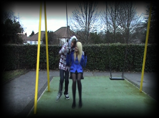
This was then edited to allow for an easy understanding of the video.


Untitled from Alex Newcombe on Vimeo.


From our audience feedback, we have learned that the storyline could be improved as we have left a couple of viewers of the video became confused about what happened to the girl, and although this was partially the desired effect as we wished to leave the video on a cliff-hanger, the confusion was in a negative way rather than the attempted positive way which would leave them curious as to what happens, and this would hopefully lead to them wishing to see the next video. However, we were told by the people who would perhaps have a better understanding of the skills and techniques used in filming and editing that it was "difficult to pick some negatives" from our music video. Furthermore, it seems that the overall view of the music video is positive, as the majority of people that viewed it found it to be of a good quality, with it of a similar standard to mainstream music videos.

Evaluation Question 4

How did you use media technologies in the construction and research, planning and evaluation stages?

Evaluation Question 4 from Alex Newcombe on Vimeo.

Evaluation Question 1

    In what ways does your media product use, develop or challenge forms and conventions of real media products?

    Our group decided to do the song ‘Winter’ by Joshua Radin. This song is of the apparent folk music genre as albums written by the artist have performed well in this genre chart. However, the song is more commonly considered to be an acoustic song as it has nothing other than the voice of Joshua Radin and an acoustic guitar. This meant that we would be filming a music video for a song with a very slow tempo and therefore we wo
    uld have to plan our video accordingly, for example a performance video would not be suitable as it would be too repetitive, although our rough cut came perilously close to this.
    We believed the lyrics to be of a very down and depressing tone, as we took them to generally mean that the artist has lost someone, whether this be through death or through a breakup we are unsure. However, personally I assume it is a breakup because most songs of this genre tend to be about love, as they are most akin to the traditional ballad form.
    Reading the lyrics, we decided to create the idea of a breakup and perhaps to leave the video itself on a bit of a cliff-hanger, similar to the style of video used by Don Broco in their videos ‘Dreamboy’ and ‘Top of the World’, as these carry on from each other.
    We begin with Glenn and Lucy, the only two characters in the video, appearing to be very happy together. They joke about and take pictures in situations together that they seem to want to remember. All in all, it allows for a very upbeat tone to the beginning of the video. This is slightly different to the conventional videos of this genre as they seem to be more based around the constant mourning of a loss they have experienced. In this sense, the beginning of our video challenges the typical media conventions. However, we do adhere to the stereotype of the genre, as we have Lucy alone in a white dress with red ribbons round her wrists and she is holding a red rose. This imagery hints towards depression and perhaps even death, and this contradicts the original happy image we see of the couple.
    We then see a twist in the storyline as the couple begin to argue in the car scene, which suggests that we are beginning to move towards finding out what happens to the girl to leave her alone clutching at a rose.
    The
    audience then sees Glenn trying to win back Lucy, by taking her roses to her door. This is not filmed in a way that coheres to music videos as a whole, as we used a first person shot so that the audience can emphasise with Glenn, and see it through his eyes.
    Finally, we see Glenn throw the roses down as he admits defe
    at and after he storms off, Lucy bends down and picks up a single rose before turning inside and leaning against the door. This then cross fades into Lucy in the woods holding onto the rose, linking in with the storyline, but not solving the viewer’s questions about what happens.

    We used a variety of camera angles in the filming of our music video, a
    nd we tried to not use too much camera movement as the tempo of the song and the genre of the music do not generally allow for too much movement, as that is generally more suited to a faster paced song.
    This is the predominant shot used in our music video to show Glenn lip-syncing to the song. This is a common shot used in all types of music videos as it is a medium close-up, and allows for the artist or star of the video (who is normally the marketing point for the product) to be exposed to the audience more.
    This s
    hot was directly linked to the lyrics in the song, as at this point in the video we hear “I could've lost myself in rough blue waters in your eyes”. This is a very common technique in music videos as well, as it allows the video to be linked back to the song. Furthermore, by linking the video back to the song, it can be made into a potentially memorable line, which means that when the song is being listened to the audience would remember that shot.
    The shot in which the camera rotates clockwise around Lucy, whilst she turns counter-clockwise looking confused and dazed, was designed to add to the element of curiosity we hoped the audience would be feeling as they would wish to know what she seems so frightened of, and why is she so alone in the woods? In relevance to the whole of the video, it helps add to the cliff-hanger ending as it could have been the moment when something potentially horrible happened to Lucy. It adheres to the conventions of music videos to an extent, as it displays similarities with the previously mentioned Don Broco music videos, although they present their work in a more satirical manner.
    This shot links the entirety of the video together at the end. It allows the audience to understand how Lucy got the rose, and why she would be depressed, but it fails to explain how she reached the woods, what happened to Glenn and what happens to her. This is why I believe the final shot to be so effective because it leaves the audience asking many questions, which if I were to do another music video by Joshua Radin I would continue this storyline on.

    We filme
    d our music video in many locations. Primarily we used the woods and surrounding fields in West Kingsdown. The woods were very effective as the dull natural lighting provided by the British weather adds to the eerie nature of the music video, and it also helps keep the tone of the music video depressive.
    Furthermore, a lot of the filming was conducted at my house, as it was convenient. It allowed us to effectively portray the couple as bei
    ng very happy and content together in the early memory shots, and the lighting in the house was the normal house lighting so it added to the genuine nature of the music video. The only lighting we did fake was in fact for the television shot, when we turned the room lights off and used a bedside lamp to replicate the light of a television.
    The only ot
    her places we filmed were opposite my house, in which a streetlight provided the lighting at night-time; a park for the swing shot and a cul-de-sac which allowed for us to film the shot in the car without disturbance.

    The editing proved to be the most important part in trying to adhere to the conventions of our genre.
    We had to use slow editing techniques because a fast paced video would not fit very well with the tempo of our music. This is why we predominantly used cross-dissolves as these are much slower than straight cuts and they allow for slower transitions between shots.
    Furthermore,
    we used slow motion at a couple of points in the video, slowing it by up to 50%, as this helps add to the tempo of the music and it suits the music video quite well, adding a dramatic effect at times, such as when the beer bottle is slammed down.
    Finally, we used edge blur and motion blur for the memories as this allows for the audience to clearly see what is a memory, and the motion blur also conveys the idea that perhaps Glenn is starting to forget these memories.

    To conclude, I believe that our music video adheres to the conventions of the genre and of music videos in general, but in some places it challenges them, but I believe this just adds to the whole memorable nature of the video.

    The ancillary task was difficult to plan as we struggled to find many real life media representations of magazine adverts for CD digipaks. However, in Metal Hammer, a magazine from a different genre, we found several. We tried to keep to the styles and conventions we found in these, and we attempted to include all that was included in the real life magazine advert.


    For the CD digipak, we researched many album covers that allowed us to create an idea of a product that fits in to a real world convention. We discovered that there are normally two types of album cover, ones with some sort of picture of the artist on them, and ones with no relation, but normally are memorable. We decided to go for a picture of the artist, as we could then easily link this into the music video, and this allowed for us to complete the creation of our multi-platform brand.


=

Evaluation Question 2

How effective is the combination of your main product and ancillary texts?
    I believe that the combination of our main task and our ancillary tasks is very effective. It is very easy for the audience to make a link between the music video and the ancillary tasks. This is due to several things:
    • The continuity of the font, i.e. we used the same font style of ‘Sweet Confusion’ on both of our Ancillary tasks.


    • We use similar colours in the Ancillary tasks, such as with the font which is very alike in both tasks, a bright gold/silver colour. Furthermore, the predominant tone of both the Ancillary tasks is dark, and this helps link to the music video as well, as the tempo is slow and the interpretation is moderately depressing.
    • The images used in the Ancillary tasks are directly linked to the main product of the music video. The CD digipak has a picture very similar to a shot we used in the final cut of the music video, which is a shot of Glenn standing in front of a pond with a cigarette in his hand. Although this is heavily edited, to make it stand out more, the camera angles are very similar and the contents of the shot are the same. Moreover, the relation between the magazine advert and the music video was more evident in the rough cut video as the picture on the advert was taken directly from the rough cut. We planned to overlay a faded image of Glenn onto the shoulder of Glenn, but this shot did not make the final cut. However, the mise en scene used in the advert is evident throughout the music video itself and the same camera angle with Glenn in the same position is used multiple times.
    • Furthermore, the Ancillary tasks are both linked through images as the magazine digipak has a picture of the CD digipak front cover on it, so the audience are aware of the product they could potentially be buying.

    • Another point that links the main task to the magazine digipak is the fact that the use of faded shots is a major feature of both. The main focal point of the ancillary task is the picture of Glenn with his hood up looking down, and during the video there is a point in which we have used the original overlay idea, but not with the original picture that we choose for the magazine advert.

    This has all led to what can only be considered a house style being created. This house style led to the same font being used along with similar images and this allowed for all of the tasks to interconnect. The main product is the centre of the ancillary tasks, as the ancillary tasks derive directly from the main product, which allows the link to be clearly seen by the potential audience.

    Furthermore, whilst creating our product we aimed to create a multi-platform brand that would allow for our product to achieve the maximum amount of publicity and would lead to maximum revenue. The creation of our ancillary tasks linking to the main product of our music video has created the theoretical multi-platform brand, and it allows for maximum reach to my ideal target audience.

Final Cut

Group S.A.G FINAL CUT from Alex Newcombe on Vimeo.

Final Ancillary Tasks


Magazine advert for the Digipak Final


CD Digipak Final

Wednesday, 9 March 2011

Animatic

Animatic from Alex Newcombe on Vimeo.


Here is the Animatic. This was made previous to our Rough Cut, and in hindsight we can clearly see that the audience feedback that we recieved was correct and our video was in fact going to be very repetitive. This lead to dramatic changes, which included the introduction of a storyline and the construction of a video generally less repetitive and more entertaining than the original.

Friday, 18 February 2011

Storyboard

A bit late, but here is the storyboard that we did before our rough cut.
Since we completed this, we have received our audience feedback, and can see that it is in fact very repetitive. This is why we have re-planned our project so that it is more entertaining and captivates the audience more.

Tuesday, 15 February 2011

Editing Techniques

As Glenn has been the one doing the editing, he has begun posting the techniques he has been using so far.
- Cross Dissolve
- Dip to Color Dissolve
- Soft Edges

Rough Cut 2.0

Group S.A.G. Rough Cut 2.0 from Alex Newcombe on Vimeo.

We have this second video to help show how we have appreciated the audience feedback and taking it into account, made some changes. Unfortunately, because we have had to make such a large amount of changes, we feel that it would be best to post this video to act as a stage between the Rough cut and the final cut.

Cd Digipak

As Sophie is creating the CD Digipak, here are the links to the posts she has done on them:
- CD Pictures
- CD Digipak Cover Final

Monday, 14 February 2011

Audience Feedback for Rough Cut

We received very consistent criticism of our rough cut. Almost every person who told us their views said that the storyline was too repetitive. There was also a criticism of the way in which the guitar shots were used, and how perhaps they were too dark. Furthermore, we cut too often between the shots of Glenn singing against the tree, and when he is playing the guitar.

There is no variety in the way we filmed and this has lead to us planning on how to add more variety into the video.
To do this, we have planned to increase the relevance of the girl in our video (Lucy Fry) to the storyline, and to build the idea of them [Glenn and Lucy] being together. We thought of perhaps different locations to film it in, as well as what the storyline would entail. We decided on elaborating on the idea of Lucy dying as we used some imagery in the mise en scene to show this. The red ribbons symbolise depression, and the rose is a traditional symbol of death. We therefore elaborated on the idea and plan to introduce the idea of Lucy has died, and we see Glenn reliving memories of times with her, but she almost fades from view.


The other main criticism we had was at the beginning of the video, when Glenn begins to lip sync it is out of time with the vocals. This of course needed to be changed, and when we watched the video through afterwards, we began to notice a few more places in which the lip syncing was slightly out of time. Changing this was easy to do and makes the whole video seem a lot more professional.

Wednesday, 2 February 2011

Magazine Advert for Digipak Final

    To begin with, we took the picture from our rough-cut attempt of when we wished to use an overlay of Glenn above the right shoulder of Glenn singing. To do this we had to first crop a shot of Glenn looking down. This shot was then feathered and the opacity was dropped so that the image sat nicely on top of Glenn’s shoulder. However, this shot did not make the final cut.
    Yet when attempting to edit this, I saw the shot as it was without it being overlaid onto the other image of Glenn. I then performed a screen grab of this and it ended up looking like this:

    I then had to edit the purple mark on top of Glenn’s hood out of the picture, and for this I used the patch tool. This allowed for me to remove this blemish and it then seemed as if it was never there.

    I then went on to choose a font as this is key to both this ancillary task, and the CD cover as we wished to create a house style. was lucky seen as the first font that I saw on dafont.com was in fact 'Sweet Confusion', which I believe suited the purposes of this very well. I then downloaded this to Photoshop, the program used for the design of the magazine digipak.

    I began to type out the text for the first draft, alongside and around the image. After typing this out, I decided to try and attempt to put an outer glow on the text, as it seemed to plain, and after a while of testing different settings, I settled on:
    Opacity: 100%
    Technique: Softer
    Spread: 0
    Size: 6
    Range: 50%
    Jitter: 0%

    Furthermore, I downloaded a star font to use in the creation of the stars for the reviews of the album. Unfortunately, the stars were not very attractive so I had to edit them by adding a 'Bevel and Emboss' feature. I also added a contour to it. This left me with a very satisfactory shape and look to the stars, which I believe fitted in with both the piece and other real world adverts.

    However, as mentioned in an earlier blog post, I discovered that the magazine advert had to be designed for an A4 piece. This proved to be a hindrance as the picture would not stretch to an A4 piece of paper without looking obviously stretched, so I had to redesign the cover.
    I used almost all of the same text, having to edit the settings for the outer glow as the font size had to be increased.
    This left me with this draft of the advert:


    However, after receiving feedback regarding this, I discovered that it was too empty and did not have enough on the page. Due to this I added in a picture of the CD cover, which I went on to add an outer glow to. I then rearranged the layout of the page so the CD cover fitted in better. Finally, I added in 3 logos at the bottom of the page to authenticate the advert more. These were the iTunes logo; the logo for Joshua Radin's record label, Mom and Pop records; and the HMV logo.
    This meant that my final draft was:


    I believe that our group's magazine advert has turned out very well and that it represents a very standard representation of real media adverts. Furthermore, I believe that is a piece that attracts the viewers eye with its simple layout and colour scheme and that it would encourage many people to purchase the album.

Monday, 31 January 2011

Magazine Analysis

Whilst conducting my magazine advertisement analysis, I examined several magazines. These included multiple copies of both ‘Kerrang!’ and ‘Metal Hammer’, as well as a copy of ‘playmusic’.
Whilst analysing these, I first looked in Kerrang!, and found the section dedicated to ‘Small Ads’. While looking through these, I found that they were mostly dedicated to online clothing shops of the more indie/emo/scene and to tour dates for bands as well. The adverts may have been towards tours for albums, but I found very little evidence towards actual albums. However, in regards to full page adverts, there was even less evidence of albums being advertised, more adverts dedicated towards the next edition of the magazine, and
the only other style of full page advert was for big brand products unrelated to music, such as hair gel and phone networks. This led me to believe that the ideal style of magazine advert would in fact be a smaller paged advert. However, since the time of this research, I have discovered that in fact we were required to create a full-page draft. By this point I had already created a first draft of our magazine advert suitable for a small ads section.
I then analysed the advert sections
in Metal Hammer. Although
this magazine is aimed at a completely different socio-economic group to our main product and its
ancillary tasks, with a completely different music genre as well, it has helped with the album advert style. I found a couple of full-page adverts, which helped me in trying to find the conventions of the media advert.

Playmusic was the last magazine I analysed, and this was a largely unhelpful and irrelevant magazine to analyse, simply because the large proportion of the magazine was dedicated to the more technical side of music, such as the different instruments and new instruments available for purchase.